


I used the similar background for my magazine cover because of the lighting. I believe that with the lighting on the stage, it puts the cover star in the limelight. The lighting in the background makes it look like the cover star is the main focus of the magazine, which was the aim.


With the cover, there was a select few photos which I didn't believe they were perfectly up to scratch for my front cover. For one, part of the right hand on both images are rather blurry, which means it wouldn't look proper on the front of a magazine, it also looks rather unprofessional.


The same applies for the above image, the image looks rather unprofessional as the character doesn't look fully focused and serious for the photo shoot, which goes against my plan for the front cover. Also, holding a microphone isn't as indie as the use of a guitar, as all indie, rock bands include guitars and various instruments in their bands. The use of a guitar gives the magazine a meaning, it gives it an indie feel, whereas a microphone can have endless possibilities. For example, it doesn't have to include music as there are many acts, including comedy, which include the use of a microphone.
For my photoshoot, I intended to have the person wearing casual clothing. I didn't intend to have my person wearing a costume because, again, it kind of goes against the feel of the magazine. For example, if you went to see an indie gig, i.e. Oasis, they don't have a set dress code, they just wear casual clothes.
For my article in my double page spread, I chose to have a hardcore article because it goes with a rock n roll, indie style background. For example, most rock and indie bands claim to have a drug-fuelled background, and it seems to act as a stimulus for their music careers. For example, Oasis had many drug related incidents in their time which caused the press to act and write articles on these incidents. So this secondary research helped with my article and was used for inspiration.
Document1 from tomanderson01
For the draft i created of my front cover, i believe i didn't use it because the photo didn't seem as professional and match the criteria enough for my magazine theme. For example, with the guitar prop, it matches my theme as indie bands use guitars, whereas any artist for any genre of music will use a microphone. the point of this was to make the magazine stand out, and to make sure the reader could understand the genre of magazine without having to read through it.


The 2 above images were 2 of a select few images that I rejected for the front cover of my magazine. First of all, I rejected and chose the image I did because, first of all, the lighting isn't as good on either of the images as it is on the image I decided to use. Also, I believe that the image background isn't suitable, mainly because it isn't plain, and therefore the focus may be taken off the main character. To add to this, the character isn't ready for the shot, which makes it look rather unprofessional and therefore, isn't in the best shape to be a magazine front cover.
I believe that the target audience for my magazine would be the age 14 onwards. I believe this because people under the age of 14 tend to listen to more pop based music, more dancing music. Whereas those over 14 tend to listen to indie music, therefore I believe this would be more suitable for those, as they could relate to the magazine.
For my magazine background the photo i used was: https://www.clarkliving.com/see-a-band-in-silver-lake/
For my preparation of my primary pictures, the tool i used on photoshop was the magic wand tool. i used this tool on the images because it removes the background off the photo. Therefore, the magazine looks more realistic, and the image fits perfectly with the background.
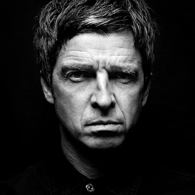
I believe a selection of the secondary i would consider adding to my magazine would be the images below, of Noel Gallagher. I would've added these to my magazine as a comparison for my article. For example, in my article where Joe talks about his life of songwriting, his story is basically directly in proportion with Noel Gallagher, how he devoted his life to it, and the drug abuse that goes with it, the stories match. Therefore i believe secondary images of Noel would make sense for the magazine, and would be relevant to the article.
The purpose of my magazine was to entertain the reader with my style and choice of topic. This is because with my article, which is a rather interesting article for the magazine, was written with a style and purpose to entice the reader. Therefore, when the reader reads my article, they will want to read further into magazine and see what happens next. Therefore the purpose of the magazine is entertainment, as it hooks and interests the reader.
I chose to create a print magazine because i feel that the print option is safer to use, as opposed to digital. This is because the fonts can appear different on digital, whereas on print you can trust the fonts and images to look as you'd wish they'd look. Whereas on digital this can't be guaranteed, therefore print will look exactly as i desire, which is the safer option.
For the draft i created of my front cover, i believe i didn't use it because the photo didn't seem as professional and match the criteria enough for my magazine theme. For example, with the guitar prop, it matches my theme as indie bands use guitars, whereas any artist for any genre of music will use a microphone. the point of this was to make the magazine stand out, and to make sure the reader could understand the genre of magazine without having to read through it.


The 2 above images were 2 of a select few images that I rejected for the front cover of my magazine. First of all, I rejected and chose the image I did because, first of all, the lighting isn't as good on either of the images as it is on the image I decided to use. Also, I believe that the image background isn't suitable, mainly because it isn't plain, and therefore the focus may be taken off the main character. To add to this, the character isn't ready for the shot, which makes it look rather unprofessional and therefore, isn't in the best shape to be a magazine front cover.
I believe that the target audience for my magazine would be the age 14 onwards. I believe this because people under the age of 14 tend to listen to more pop based music, more dancing music. Whereas those over 14 tend to listen to indie music, therefore I believe this would be more suitable for those, as they could relate to the magazine.
For my magazine background the photo i used was: https://www.clarkliving.com/see-a-band-in-silver-lake/
For my preparation of my primary pictures, the tool i used on photoshop was the magic wand tool. i used this tool on the images because it removes the background off the photo. Therefore, the magazine looks more realistic, and the image fits perfectly with the background.
I believe a selection of the secondary i would consider adding to my magazine would be the images below, of Noel Gallagher. I would've added these to my magazine as a comparison for my article. For example, in my article where Joe talks about his life of songwriting, his story is basically directly in proportion with Noel Gallagher, how he devoted his life to it, and the drug abuse that goes with it, the stories match. Therefore i believe secondary images of Noel would make sense for the magazine, and would be relevant to the article.
The purpose of my magazine was to entertain the reader with my style and choice of topic. This is because with my article, which is a rather interesting article for the magazine, was written with a style and purpose to entice the reader. Therefore, when the reader reads my article, they will want to read further into magazine and see what happens next. Therefore the purpose of the magazine is entertainment, as it hooks and interests the reader.
I chose to create a print magazine because i feel that the print option is safer to use, as opposed to digital. This is because the fonts can appear different on digital, whereas on print you can trust the fonts and images to look as you'd wish they'd look. Whereas on digital this can't be guaranteed, therefore print will look exactly as i desire, which is the safer option.


No comments:
Post a Comment